

POCO M6 Pro on Sale
Description
* ===============
POCO M6 Pro
=============== *
#poco_m6_pro {
font-size: 16px;
overflow: hidden;
color: #191919;
background-color: #DEE4F0;
}
#poco_m6_pro ul,
#poco_m6_pro ol {
list-style: none;
padding-left: 0;
}
#poco_m6_pro video, #poco_m6_pro img {
vertical-align: middle;
}
#poco_m6_pro video {
width: 100%;
height: auto;
}
#poco_m6_pro.xiaomi_container {
max-width: 2560px;
}
#poco_m6_pro .section {
line-height: 1.2;
}
#poco_m6_pro .section-bg {
background-size: cover;
background-position: center center;
background-repeat: no-repeat;
}
#poco_m6_pro .font-bold {
font-weight: 600;
}
#poco_m6_pro .font-light {
font-weight: 300;
}
#poco_m6_pro .font-color {
color: #ffd729;
}
#poco_m6_pro .text-box {
text-align: center;
color: #191919;
padding: 5% 12.5%;
}
#poco_m6_pro .text-box.text-box–left {
text-align: left;
}
#poco_m6_pro .text-box–white {
color: #ffffff;
}
#poco_m6_pro .text-box .title,
#poco_m6_pro .text-box .desc,
#poco_m6_pro .text-box .text {
display: block;
}
#poco_m6_pro .text-box .title {
font-size: 32px;
line-height: 1.2;
}
#poco_m6_pro .text-box .title.title–big {
font-size: 48px;
margin-bottom: 20px;
font-weight: 900;
}
#poco_m6_pro .text-box .desc {
font-size: 22px;
line-height: 1.5;
margin-top: 25px;
font-weight: 700;
}
#poco_m6_pro .text-box .text {
font-size: 15px;
line-height: 1.5;
margin-top: 25px;
font-weight: 300;
}
#poco_m6_pro .text-box .text.text–small {
font-size: 14px;
opacity: .5;
}
#poco_m6_pro .video-box, #poco_m6_pro .image-box {
padding: 0 12.5%;
}
#poco_m6_pro .video-box video {
width: 100%;
height: auto;
}
#poco_m6_pro .video a,
#poco_m6_pro .video .video-link {
position: relative;
z-index: 1;
display: block;
overflow: hidden;
cursor: pointer;
}
#poco_m6_pro .video a img,
#poco_m6_pro .video .video-link img {
transition: 0.3s ease-in-out transform;
}
#poco_m6_pro .video a:hover img,
#poco_m6_pro .video .video-link:hover img {
transform: scale(1.1);
}
#poco_m6_pro .video a::after,
#poco_m6_pro .video .video-link::after {
content: ;
position: absolute;
transform: translateX(-50%) translateY(-50%);
width: 56px;
height: 56px;
background: url( https: media.mi-home.pl products poco-m6-pro play-btn.png ) no-repeat center center contain;
left: 50%;
top: 50%;
z-index: 2;
}
@media (max-width: 991.98px) {
#poco_m6_pro .text-box {
padding: 5%;
}
#poco_m6_pro .text-box .title {
font-size: 26px;
}
#poco_m6_pro .text-box .title.title–big {
font-size: 36px;
}
#poco_m6_pro .video-box, #poco_m6_pro .image-box {
padding: 0 5%;
}
}
@media (max-width: 767.98px) {
#poco_m6_pro .text-box .title {
font-size: 22px;
}
#poco_m6_pro .text-box .title.title–big {
font-size: 28px;
}
#poco_m6_pro .text-box .desc {
font-size: 18px;
margin-top: 10px;
}
#poco_m6_pro .text-box .text {
margin-top: 15px;
}
}
@media only screen and (max-width: 575.98px) {
#poco_m6_pro .text-box {
padding: 10% 5%;
}
#poco_m6_pro .text-box .title {
font-size: 20px;
}
#poco_m6_pro .text-box .title.title–big {
font-size: 24px;
}
#poco_m6_pro .text-box .desc {
font-size: 16px;
}
#poco_m6_pro .text-box .text {
font-size: 14px;
}
}
@media (min-width: 1200px) {
#poco_m6_pro .text-box .text {
padding-left: 10%;
padding-right: 10%;
}
#poco_m6_pro .text-box .title {
font-size: 36px;
}
#poco_m6_pro .text-box .title.title–big {
font-size: 60px;
}
#poco_m6_pro .text-box .text {
font-size: 16px;
}
#poco_m6_pro .text-box.text-box–left .text {
padding-left: 0;
padding-right: 0;
}
}
* ===============
Add Font
=============== *
@font-face {
font-display: swap;
font-family: Xiaomi Brand ;
font-style: normal;
font-weight: 100 900;
src: url(https: i02.appmifile.com i18n fonts Brand Brand.woff2) format( woff2 )
}
#poco_m6_pro .xiaomi_product_name {
font-family: Xiaomi Brand , Camphor Pro , sans-serif !important;
}
* ===============
Custom
=============== *
#poco_m6_pro .section .box-label {
background-image: url( https: media.mi-home.pl products poco-m6-pro label-bg.png );
background-position: top center;
background-repeat: repeat-x;
background-size: auto 100%;
display: inline-block;
min-width: 180px;
margin-bottom: 20px;
font-weight: bold;
color: #191919;
padding: 10px 10px 30px 10px;
}
* ===============
Section 01
=============== *
#poco_m6_pro .section-01 {
position: relative;
z-index: 1;
}
#poco_m6_pro .section-01 .text-box {
padding-right: 50%;
padding-top: 10%;
position: absolute;
z-index: 2;
width: 100%;
top: 0;
left: 0;
}
#poco_m6_pro .section-01 .text-box .title {
font-size: 48px;
}
#poco_m6_pro .section-01 .text-box .title small {
font-size: 0.65em;
}
#poco_m6_pro .section-01 .text-box .text {
margin-top: 25px;
font-size: 16px;
font-weight: normal;
}
@media (max-width: 991.98px) {
#poco_m6_pro .section-01 .text-box .text {
font-size: 15px;
margin-top: 15px;
}
}
@media (max-width: 767.98px) {
#poco_m6_pro .section-01 .text-box .title {
font-size: 42px;
}
#poco_m6_pro .section-01 .text-box .text {
font-size: 14px;
}
}
@media only screen and (max-width: 575.98px) {
#poco_m6_pro .section-01 .text-box {
padding: 15% 5% 10%;
position: static;
text-align: center;
}
}
@media (min-width: 1200px) {
#poco_m6_pro .section-01 .text-box .title {
font-size: 64px;
}
}
* ===============
Section 02
=============== *
#poco_m6_pro .section-02 {
background-color: #434B62;
padding-bottom: 7.5%;
padding-top: 7.5%;
}
#poco_m6_pro .section-02 .section-wrapper {
max-width: 980px;
width: 90%;
margin: 0 auto;
display: flex;
flex-wrap: wrap;
justify-content: space-between;
}
#poco_m6_pro .section-02 .section-wrapper .item {
margin-bottom: 15px;
position: relative;
z-index: 1;
}
#poco_m6_pro .section-02 .section-wrapper .item .text-wrapper {
position: absolute;
z-index: 2;
top: 0;
left: 0;
width: 100%;
font-size: 15px;
font-weight: 300;
padding: 10%;
}
#poco_m6_pro .section-02 .section-wrapper .item .text-wrapper .title {
font-weight: bold;
margin-bottom: 5px;
font-size: 21px;
}
#poco_m6_pro .section-02 .section-wrapper .item-1,
#poco_m6_pro .section-02 .section-wrapper .item-4 {
flex: 0 0 100%;
width: 100%;
}
#poco_m6_pro .section-02 .section-wrapper .item-2 {
flex: 0 0 calc(61% – 10px);
width: calc(61% – 10px);
}
#poco_m6_pro .section-02 .section-wrapper .item-3 {
flex: 0 0 calc(39% – 10px);
width: calc(39% – 10px);
}
#poco_m6_pro .section-02 .section-wrapper .item-1 .text-wrapper {
text-align: center;
padding: 5%;
}
#poco_m6_pro .section-02 .section-wrapper .item-3 .text-wrapper {
color: #ffffff;
}
#poco_m6_pro .section-02 .section-wrapper .item-4 .text-wrapper {
padding-left: 67.5%;
padding-top: 15%;
}
@media (max-width: 767.98px) {
#poco_m6_pro .section-02 .section-wrapper .item .text-wrapper .title {
font-size: 18px;
}
}
@media only screen and (max-width: 575.98px) {
#poco_m6_pro .section-02 .section-wrapper .item-2,
#poco_m6_pro .section-02 .section-wrapper .item-3 {
flex: 0 0 100%;
width: 100%;
}
#poco_m6_pro .section-02 .section-wrapper .item .text-wrapper {
font-size: 14px;
}
#poco_m6_pro .section-02 .section-wrapper .item .text-wrapper .title {
font-size: 16px;
}
#poco_m6_pro .section-02 .section-wrapper .item-4 .text-wrapper {
padding-left: 65%;
padding-top: 7.5%;
padding-right: 5%;
}
}
@media only screen and (max-width: 363.98px) {
#poco_m6_pro .section-02 .section-wrapper .item-4 .text-wrapper {
padding: 10% 0 5%;
position: static;
color: #fff;
}
}
* ===============
Section 03
=============== *
#poco_m6_pro .section-03 {
padding-top: 2.5%;
}
#poco_m6_pro .section-03 .list {
max-width: 980px;
width: 90%;
margin: 0 auto;
display: flex;
flex-wrap: wrap;
justify-content: center;
}
#poco_m6_pro .section-03 .list .item {
font-size: 15px;
font-weight: 300;
padding: 20px 10px;
flex: 0 0 33.3333%;
width: 33.3333%;
color: #191919;
text-align: center;
}
#poco_m6_pro .section-03 .list .item .title {
font-size: 21px;
margin-bottom: 5px;
font-weight: bold;
}
#poco_m6_pro .section-03 .list .item:nth-child(1),
#poco_m6_pro .section-03 .list .item:nth-child(2) {
flex: 0 0 50%;
width: 50%;
}
@media (max-width: 767.98px) {
#poco_m6_pro .section-03 .list .item .title {
font-size: 18px;
}
}
@media only screen and (max-width: 575.98px) {
#poco_m6_pro .section-03 .list .item {
font-size: 14px;
}
#poco_m6_pro .section-03 .list .item .title {
font-size: 16px;
}
}
@media only screen and (max-width: 363.98px) {
#poco_m6_pro .section-03 .list .item:nth-child(1),
#poco_m6_pro .section-03 .list .item:nth-child(2),
#poco_m6_pro .section-03 .list .item {
flex: 0 0 100%;
width: 100%;
}
}
@media (min-width: 1200px) {
#poco_m6_pro .section-03 .list .item .title {
font-size: 24px;
}
}
* ===============
Section 04
=============== *
#poco_m6_pro .section-04 {
background-color: #000000;
position: relative;
z-index: 1;
}
#poco_m6_pro .section-04 .text-box {
position: absolute;
z-index: 2;
top: 5%;
left: 0;
width: 100%;
padding-left: 55%;
}
@media (max-width: 767.98px) {
#poco_m6_pro .section-04 .text-box {
position: static;
padding: 10% 5%;
text-align: center;
}
}
* ===============
Section 05
=============== *
#poco_m6_pro .section-05 {
background-color: #081213;
position: relative;
z-index: 1;
}
#poco_m6_pro .section-05 .text-box {
position: absolute;
z-index: 2;
top: 0;
left: 0;
width: 100%;
}
@media only screen and (max-width: 575.98px) {
#poco_m6_pro .section-05 .text-box {
position: static;
}
}
* ===============
Section 06 & 07
=============== *
#poco_m6_pro .section-06,
#poco_m6_pro .section-07 {
background-color: #CDD6E7;
padding-top: 2.5%;
padding-bottom: 5%;
}
#poco_m6_pro .section-07 {
padding-bottom: 10%;
}
#poco_m6_pro .section-06 .image-wrapper,
#poco_m6_pro .section-07 .image-wrapper {
max-width: 1160px;
width: 90%;
margin: 0 auto;
}
#poco_m6_pro .section-07 .image-wrapper {
position: relative;
z-index: 1;
color: #ffffff;
font-size: 15px;
}
#poco_m6_pro .section-07 .image-wrapper .text {
position: absolute;
z-index: 2;
left: 0;
top: 0;
padding: 4% 5% 5% 12.5%;
line-height: 1.5;
}
@media (max-width: 991.98px) {
#poco_m6_pro .section-07 .image-wrapper {
font-size: 14px;
}
}
@media only screen and (max-width: 575.98px) {
#poco_m6_pro .section-07 .image-wrapper {
font-size: 13px;
}
}
@media only screen and (max-width: 363.98px) {
#poco_m6_pro .section-07 .image-wrapper {
font-size: 11px;
}
}
* ===============
Section 08
=============== *
#poco_m6_pro .section-08 {
background-color: #CDD6E7;
}
#poco_m6_pro .section-08 .text-box {
position: relative;
z-index: 1;
margin-bottom: -20%;
}
#poco_m6_pro .section-08 .text-box .text {
padding-left: 15%;
padding-right: 15%;
}
@media only screen and (max-width: 363.98px) {
#poco_m6_pro .section-08 .text-box .text {
padding-left: 5%;
padding-right: 5%;
}
}
* ===============
Section 09
=============== *
#poco_m6_pro .section-09 {
background-color: #434D66;
padding-top: 5%;
}
#poco_m6_pro .section-09 .text-box {
position: relative;
z-index: 1;
margin-bottom: -10%;
}
* ===============
Section 10
=============== *
#poco_m6_pro .section-10 {
background-color: #404A63;
}
#poco_m6_pro .section-10 .list {
max-width: 980px;
width: 90%;
margin: 0 auto;
display: flex;
flex-wrap: wrap;
justify-content: center;
}
#poco_m6_pro .section-10 .list .item {
font-size: 15px;
font-weight: 300;
padding: 10px;
flex: 0 0 33.3333%;
width: 33.3333%;
color: #ffffff;
text-align: center;
}
#poco_m6_pro .section-10 .list .item .title {
font-size: 24px;
margin-bottom: 5px;
font-weight: bold;
}
@media (max-width: 991.98px) {
#poco_m6_pro .section-10 .list .item .title {
font-size: 21px;
}
}
@media only screen and (max-width: 575.98px) {
#poco_m6_pro .section-10 .list .item {
font-size: 14px;
}
#poco_m6_pro .section-10 .list .item .title {
font-size: 16px;
}
}
@media only screen and (max-width: 363.98px) {
#poco_m6_pro .section-10 .list .item {
flex: 0 0 50%;
width: 50%;
}
}
@media (min-width: 1200px) {
#poco_m6_pro .section-10 .list .item .title {
font-size: 28px;
}
}
* ===============
Section 11
=============== *
#poco_m6_pro .section-11 {
position: relative;
z-index: 1;
background-color: #E5E9F2;
}
#poco_m6_pro .section-11 .text-box {
position: absolute;
z-index: 2;
width: 100%;
left: 0;
top: 0;
padding-right: 55%;
padding-left: 10%;
}
#poco_m6_pro .section-11 .text-box .text-sub {
margin-top: 5px;
}
@media (max-width: 991.98px) {
#poco_m6_pro .section-11 {
padding-top: 30%;
}
}
@media (max-width: 767.98px) {
#poco_m6_pro .section-11 {
padding-top: 2.5%;
}
#poco_m6_pro .section-11 .text-box {
position: static;
padding-right: 5%;
padding-left: 5%;
}
}
* ===============
Section 12 & 13 & 14 & 15 & 16
=============== *
#poco_m6_pro .section-12,
#poco_m6_pro .section-13,
#poco_m6_pro .section-14,
#poco_m6_pro .section-15,
#poco_m6_pro .section-16 {
background-color: #CED7E8;
padding-top: 2.5%;
padding-bottom: 5%;
}
#poco_m6_pro .section-12 .image-wrapper,
#poco_m6_pro .section-13 .image-wrapper,
#poco_m6_pro .section-15 .image-wrapper,
#poco_m6_pro .section-16 .image-wrapper {
max-width: 1160px;
width: 90%;
margin: 0 auto;
}
#poco_m6_pro .section-14 .image-wrapper {
padding-left: 12.5%;
}
#poco_m6_pro .section-16 .image-wrapper {
position: relative;
z-index: 1;
}
#poco_m6_pro .section-16 .image-wrapper .text {
position: absolute;
z-index: 2;
bottom: 0;
left: 0;
width: 100%;
color: #ffffff;
font-weight: bold;
font-size: 21px;
display: flex;
}
#poco_m6_pro .section-16 .image-wrapper .text .item {
flex: 0 0 50%;
width: 50%;
padding: 2.5% 5%;
}
@media (max-width: 991.98px) {
#poco_m6_pro .section-16 .image-wrapper .text {
font-size: 18px;
}
}
@media (max-width: 767.98px) {
#poco_m6_pro .section-16 .image-wrapper .text {
font-size: 16px;
}
}
@media only screen and (max-width: 575.98px) {
#poco_m6_pro .section-16 .image-wrapper .text {
font-size: 14px;
}
}
* ===============
Section 17
=============== *
#poco_m6_pro .section-17 {
background-color: #CED7E8;
padding-top: 2.5%;
}
* ===============
Section 18
=============== *
#poco_m6_pro .section-18 {
background-color: #434D66;
padding-top: 5%;
}
#poco_m6_pro .section-18 .text-box {
margin-bottom: -10%;
position: relative;
z-index: 1;
}
* ===============
Section 19
=============== *
#poco_m6_pro .section-19 {
background-color: #434D66;
padding-bottom: 5%;
}
#poco_m6_pro .section-19 .slider-box {
max-width: 1160px;
width: 90%;
margin: 0 auto;
}
#poco_m6_pro .section-19 .slider-box .slider-item {
position: relative;
z-index: 1;
padding-bottom: 60px;
}
#poco_m6_pro .section-19 .slider-box .slider-item .text-wrapper {
position: absolute;
z-index: 2;
width: 100%;
left: 0;
bottom: 12.5%;
display: flex;
padding: 5%;
}
#poco_m6_pro .section-19 .slider-box .slider-item .text-wrapper > * {
flex: 0 0 50%;
}
#poco_m6_pro .section-19 .slider-box .slider-item .text-wrapper .title {
font-size: 21px;
font-weight: bold;
}
@media (max-width: 767.98px) {
#poco_m6_pro .section-19 .slider-box .slider-item .text-wrapper {
bottom: 15%;
font-size: 15px;
}
}
@media only screen and (max-width: 575.98px) {
#poco_m6_pro .section-19 .slider-box .slider-item .text-wrapper {
font-size: 14px;
bottom: 20%;
}
#poco_m6_pro .section-19 .slider-box .slider-item .text-wrapper .title {
font-size: 18px;
}
}
* ===============
Section 20
=============== *
#poco_m6_pro .section-20 {
background-color: #434D66;
padding-top: 2.5%;
padding-bottom: 5%;
}
#poco_m6_pro .section-20 .image-wrapper {
max-width: 1160px;
width: 90%;
margin: 0 auto;
}
* ===============
Section 21
=============== *
#poco_m6_pro .section-21 {
background-color: #434D66;
padding-top: 2.5%;
padding-bottom: 5%;
}
#poco_m6_pro .section-21 .slider-box {
max-width: 1160px;
width: 90%;
margin: 0 auto;
}
* ===============
Section 22
=============== *
#poco_m6_pro .section-22 {
background-color: #434D66;
padding-top: 2.5%;
padding-bottom: 7.5%;
}
#poco_m6_pro .section-22 .list {
position: relative;
z-index: 2;
width: 90%;
max-width: 980px;
margin: 0 auto;
display: flex;
flex-wrap: wrap;
padding-left: 5%;
margin-top: -20%;
}
#poco_m6_pro .section-22 .list .item {
flex: 0 0 50%;
width: 50%;
display: flex;
padding: 20px 5% 20px 0;
font-size: 15px;
color: #ffffff;
}
#poco_m6_pro .section-22 .list .item .image-wrapper {
flex: 0 0 60px;
width: 60px;
padding-right: 15px;
}
#poco_m6_pro .section-22 .list .item .text-wrapper {
font-size: 15px;
font-weight: 300;
}
#poco_m6_pro .section-22 .list .item .title {
font-weight: bold;
font-size: 18px;
margin-bottom: 5px;
}
@media (max-width: 991.98px) {
#poco_m6_pro .section-22 .list {
padding: 0 5%;
}
#poco_m6_pro .section-22 .list .item .title {
font-size: 16px;
}
}
@media only screen and (max-width: 575.98px) {
#poco_m6_pro .section-22 .list .item {
flex: 0 0 100%;
width: 100%;
}
#poco_m6_pro .section-22 .list .item .text-wrapper {
font-size: 14px;
}
}
@media (min-width: 1200px) {
#poco_m6_pro .section-22 .list .item {
padding: 30px 5% 30px 0;
}
}
* ===============
Section 23
=============== *
#poco_m6_pro .section-23 {
position: relative;
z-index: 1;
background-color: #EBF0F5;
}
#poco_m6_pro .section-23 .text-box {
position: absolute;
z-index: 2;
left: 0;
top: 0;
width: 100%;
}
#poco_m6_pro .section-23 .text-box .text:last-child {
margin-top: 0;
}
@media (max-width: 991.98px) {
#poco_m6_pro .section-23 {
padding-top: 12.5%;
}
}
@media (max-width: 767.98px) {
#poco_m6_pro .section-23 {
padding-top: 20%;
}
}
@media only screen and (max-width: 575.98px) {
#poco_m6_pro .section-23 {
padding-top: 50%;
}
}
@media only screen and (max-width: 363.98px) {
#poco_m6_pro .section-23 {
padding-top: 95%;
}
}
* ===============
Section 24
=============== *
#poco_m6_pro .section-24 {
background-color: #CED7E8;
padding-top: 2.5%;
padding-bottom: 7.5%;
}
#poco_m6_pro .section-24 .image-wrapper {
max-width: 1160px;
width: 90%;
margin: 0 auto;
}
* ===============
Section 25
=============== *
#poco_m6_pro .section-25 {
background-color: #CED7E8;
padding-bottom: 5%;
}
* ===============
Section 26
=============== *
#poco_m6_pro .section-26 {
background-color: #404A63;
padding-top: 2.5%;
}
#poco_m6_pro .section-26 .text-box {
position: relative;
z-index: 1;
margin-bottom: -10%;
}
* ===============
Section 27
=============== *
#poco_m6_pro .section-27 {
background-color: #404A63;
padding-bottom: 5%;
}
#poco_m6_pro .section-27 .slider-box {
max-width: 1520px;
width: 75%;
margin: 0 auto;
}
#poco_m6_pro .section-27 .slider-box .slider-item {
padding-bottom: 80px;
}
#poco_m6_pro .section-27 .slider-box .text-wrapper {
margin-bottom: 30px;
font-size: 21px;
font-weight: bold;
color: #ffffff;
}
@media (max-width: 991.98px) {
#poco_m6_pro .section-27 .slider-box {
width: 90%;
}
}
@media (max-width: 767.98px) {
#poco_m6_pro .section-27 .slider-box .text-wrapper {
font-size: 18px;
}
}
@media only screen and (max-width: 363.98px) {
#poco_m6_pro .section-27 .slider-box .text-wrapper {
font-size: 16px;
}
}
* ===============
Section 28
=============== *
#poco_m6_pro .section-28 {
background-color: #364059;
}
#poco_m6_pro .section-28 .slider-item {
position: relative;
z-index: 1;
}
#poco_m6_pro .section-28 .slider-item .text {
position: absolute;
z-index: 2;
width: 50%;
padding: 5%;
bottom: 0;
left: 0;
font-size: 24px;
font-weight: bold;
text-align: center;
color: #ffffff;
}
@media (max-width: 991.98px) {
#poco_m6_pro .section-28 .slider-item .text {
font-size: 21px;
}
}
@media only screen and (max-width: 575.98px) {
#poco_m6_pro .section-28 .slider-item {
padding-bottom: 60px;
}
#poco_m6_pro .section-28 .slider-item .text {
font-size: 18px;
position: static;
width: 100%;
padding: 10px;
}
}
@media only screen and (max-width: 363.98px) {
#poco_m6_pro .section-28 .slider-item .text {
font-size: 16px;
}
}
* ===============
Section 29
=============== *
#poco_m6_pro .section-29 {
background-color: #364059;
padding-top: 2.5%;
padding-bottom: 7.5%;
}
#poco_m6_pro .section-29 .image-wrapper {
max-width: 980px;
width: 90%;
margin: 0 auto;
}
#poco_m6_pro .section-29 .image-wrapper .item {
margin-bottom: 20px;
position: relative;
z-index: 1;
color: #191919;
font-size: 24px;
font-weight: bold;
}
#poco_m6_pro .section-29 .image-wrapper .item .text {
position: absolute;
z-index: 2;
top: 45%;
left: 0;
width: 35%;
padding: 10px;
text-align: center;
}
@media (max-width: 991.98px) {
#poco_m6_pro .section-29 .image-wrapper .item {
font-size: 21px;
}
}
@media only screen and (max-width: 575.98px) {
#poco_m6_pro .section-29 .image-wrapper .item {
font-size: 16px;
}
#poco_m6_pro .section-29 .image-wrapper .item:last-child .text {
top: 25%;
}
}
* ===============
Section 30
=============== *
#poco_m6_pro .section-30 {
background-color: #364059;
padding-bottom: 10%;
}
#poco_m6_pro .section-30 .list {
max-width: 980px;
margin: 0 auto;
width: 905;
display: flex;
flex-wrap: wrap;
}
#poco_m6_pro .section-30 .list .item {
flex: 0 0 25%;
width: 25%;
text-align: center;
padding: 20px 10px;
color: #ffffff;
font-size: 15px;
}
#poco_m6_pro .section-30 .list .item img {
display: inline-block;
height: 64px;
margin-bottom: 10px;
}
@media (max-width: 991.98px) {
#poco_m6_pro .section-30 .list .item img {
height: 54px;
}
}
@media only screen and (max-width: 575.98px) {
#poco_m6_pro .section-30 .list .item {
font-size: 14px;
flex: 0 0 50%;
width: 50%;
}
#poco_m6_pro .section-30 .list .item img {
height: 48px;
}
}
* ===============
Section 32
=============== *
#poco_m6_pro .section-32 {
background: linear-gradient(to right, rgba(229,233,245,1) 0%,rgba(153,168,197,1) 100%);
}
* ===============
Section spec
=============== *
#poco_m6_pro .section-notes {
padding: 3.5% 12.5%;
margin: 0 auto;
}
#poco_m6_pro .section-notes ul {
margin: 0;
padding: 0;
list-style: none;
}
#poco_m6_pro .section-notes ul li {
color: #191919;
font-size: 13px;
line-height: 1.5;
font-weight: 300;
opacity: .5;
padding-bottom: 5px;
}
@media (max-width: 991.98px) {
#poco_m6_pro .section-notes {
padding: 5%;
}
#poco_m6_pro .section-notes ul li {
font-size: 13px;
}
}
@media (min-width: 1200px) {
#poco_m6_pro .section-notes {
padding: 3.5% 0;
max-width: 1164px;
}
}
* ===============
Slider
=============== *
#poco_m6_pro .slick-dots {
bottom: 35px;
}
#poco_m6_pro .slick-slider .slick-slide {
font-family: Camphor Pro ;
}
#poco_m6_pro .slick-dots li button::before {
font-size: 15px;
color: #ffffff;
transition: 0.3s ease-in-out opacity;
font-family: slick ;
line-height: 20px;
position: absolute;
top: 0;
left: 0;
width: 20px;
height: 20px;
content: • ;
text-align: center;
opacity: .25;
-webkit-font-smoothing: antialiased;
-moz-osx-font-smoothing: grayscale;
}
#poco_m6_pro .slick-dots li.slick-active button::before,
#poco_m6_pro .slick-dots li:hover button::before {
opacity: 1;
}
#poco_m6_pro .slick-dotted.slick-slider {
margin-bottom: 0;
padding: 0;
}
#poco_m6_pro .slick-slider > .slider-item {
display: none;
}
#poco_m6_pro .slick-slider > .slider-item:first-child {
display: block;
}
#poco_m6_pro .slick-slider .slick-dots li button {
border-radius: 30px;
}
#poco_m6_pro .slick-slider .slick-dots li button {
background: #fff;
transition: 0.3s ease-in-out opacity;
opacity: .25;
width: 15px;
height: 15px;
}
#poco_m6_pro .slick-slider .slick-dots li.slick-active button,
#poco_m6_pro .slick-slider .slick-dots li button:hover {
background: #fff;
opacity: 1;
}
#poco_m6_pro .slick-dots li button::before {
content: none;
}
@media (max-width: 767.98px) {
#poco_m6_pro .slick-dots {
bottom: 15px;
}
}
* If you re copying, you are a very bad person. Very. *
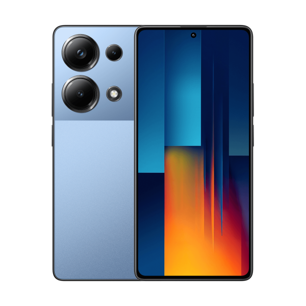
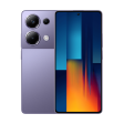
Atrakinkite savo pramogas
Baterija 5000mAh (tipo)
Helio G99-Ultra
6.67 Flow AMOLED.
Ultra plonos kraštinės užtikrina įdomų vaizdo efektą.
POCO M serijoje pirmą kartą naudojamas vėliavinių Flow AMOLED ekranas, kuris su ultra plonomis kraštinėmis užtikrina plačią žiūrėjimo kampą. Su gyvomis spalvomis, aiškiais vaizdais, dviem garsiakalbiais ir Dolby Atmos galėsite mėgautis įdomiu garso ir vaizdo pasauliu.
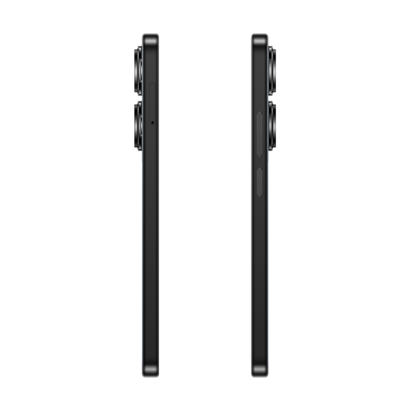
7.98mm* | 179g*
-
Maksimalus šviesumas 1300 nitų1.07 milijardai spalvų6.67 FHD+2400 × 1080100% DCI-P3Platus spalvų spektras5,000,000 : 1Kontrasto santykis
-
9+ valandosvaizdo skambučiams17+ valandostiesioginiam srautui8 valandosžaidimamsKamera
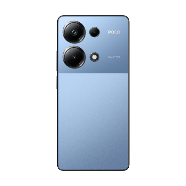
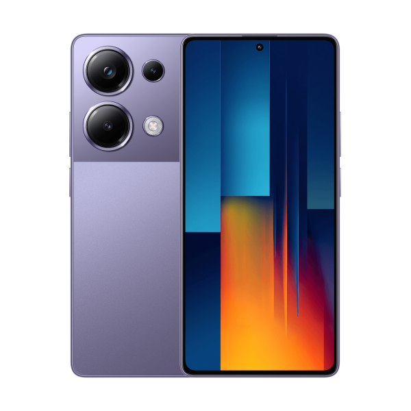
64 MP
Trigubas AI kameros komplektas.
Užfiksuokite momentą su 64 MP pagrindinio jutiklio trigubu kamerų komplektu! Pirmasis POCO M serijos OIS padeda gauti stabilius ir skaidrius vaizdus bet kuriuo dienos metu. Būkite įsitikinę dėl vaizdo kokybės su 2x artinimo technologija matricoje, kuri užtikrina daug aiškesnius vaizdus nei įprastas skaitinis artinimas.
Su Filmų kamera ir Gamtos filtro pagalba galite pabrėžti savo nuotraukų istorinį ir meninį žavesį, mėgaudamiesi kiekvieno kūrybinio momento džiaugsmu.
64MP
Pagrindinė kamera
6P objektyvas
f 1.79
1.4µm (4-in-1) Super pikseliai
Jutiklio dydis 1 2
OIS
8MP
Platumo kamera
2MP
Makro kameraStabilios ir aiškios nuotraukos su OIS stabilizacija
Užfiksuokite momentą.
Kiekvienos nuotraukos detalės.
Pirmasis OIS (optinės vaizdo stabilizacija) POCO M serijoje užtikrina stabilias ir aiškias nuotraukas su gyvomis detalėmis ir mažesniu išsiliejimu.Dviguba OIS ir EIS stabilizacijos technologija.
Pradėkite savo vlogerio kelionę su stabilia filmavimu.
Filmavimas su sklandžiais ir stabiliais efektais, ypač judant, dėka dvigubos OIS ir EIS stabilizacijos technologijos.Aiškios nuotraukos, dieną ir naktį.
Atnaujinimas 120Hz.
Paplūdimiai ir energijos taupymas.
Paplūdimiai, kaip niekada anksčiau, ritinėjimasis, judėjimas ir perjungimas su 120 Hz atnaujinimo dažniu*, kuris pirmą kartą yra prieinamas POCO M serijoje. Tinkamas atnaujinimo dažnis gali būti automatiškai pasirinktas priklausomai nuo vykdomos veiklos, užtikrinant puikų pusiausvyrą tarp sklandžios veiklos ir energijos taupymo.2160Hz nedelsiantinis prisilietimo dažnis.
Prisilietimas su 16x* raiška.
Gaukite daugiau reaktyvios ir precizines žaidimo patirties ir leiskite jam vesti jūsų pergales su pramonės lyderio nedelsiamu prisilietimo dažniu 2160 Hz* ir 16 kartų prisilietimo raiška. Vanduo netrukdys žaidimo veikimui dėl mūsų ekrano, kuris užtikrina jautrų prisilietimo valdymą net lietingomis dienomis.1920Hz PWM apšvietimas.
Malonumas akims.
Aukštesnis PWM apšvietimo dažnis mažina ekrano mirgėjimo riziką, tuo pat metu gerindamas vaizdo kokybę. Jūsų akys bus mažiau pavargusios, net tamsioje ar naktinėje aplinkoje naudojant išmanųjį telefoną.Tris TÜV Rheinland sertifikatai.
Ekrano draugiškumas akims, geresnė akies apsauga.
Dėl trijų TÜV Rheinland sertifikatų galite mėgautis mažu mėlynos šviesos lygiu ir mirgėjimu, nesijaudindami dėl akies nuovargio ir persimiego. Sertifikuotas naudotojui draugiškas ekranas padeda sumažinti akies nuovargį, reguliuodamas spalvų temperatūrą priklausomai nuo naudojamos programos ir saulės kampų. Ekranas netgi padeda sumažinti šviesos poveikį melatoninui ir pagerina miego kokybę.TÜV Rheinland Mažas mėlynos šviesos lygis
TÜV Rheinland Be mirgėjimo
TÜV Rheinland Cirkadinis draugiškumasPirštų antspaudų skaitytuvas ekrane.
Nauja atrakinimo patirtis.
Mėgaukitės greitu atrakinimu naudodami pirmąjį POCO M serijos pirštų antspaudų skaitytuvą ekrane.Įkrovimas ir baterija
Turbo įkrovimas 67W.
Intelektualus įkrovimo variklis.
Pirmasis POCO M serijos fantastinis turbo įkrovimas 67 W padeda didinti galią ir greitai įkrauti bateriją pagal poreikį. Intelektualus įkrovimo mechanizmas užtikrina ilgalaikę baterijos veiklą ir padidina įkrovimo greitį, jei baterijos lygis yra žemas.
44 minutės* iki 100%5000mAh* baterija.